XYRA FINANCE
A Conversational Approach to Money
Role
Sector
Financial Technology
Platform
Mobile
Year
2025


Locations
Lagos
INTRODUCTION
Money is alive. It moves fast, many times without warning, and it shapes daily choices for millions.
Most finance apps built for the Nigerian market prioritize moving money with minimal tracking capabilities. But Nigerians don’t just want to look at where their money went. They want to know: “What can I/should I do with what I have right now?”
That was the spark behind Xyra: an AI-powered financial companion designed not just to track money, but to help you make the right decisions when it comes to your money.
A conversational partner that understands you, speaks your language, and helps you make money moves with confidence.

THE CHALLENGE
The Design Challenge
How do we design a financial tool that feels less like complex money management software and more like a conversational partner?
How do we make conversational banking and money management safe enough to trust but fast enough to be useful?
How do we design for a spectrum of users from students to salary earners to entrepreneurs without diluting the core?
The Business Challenge
How do we prove Xyra’s agentic vision (that it can act, not just advise) with the leanest MVP possible.
How do we lay foundations for monetization without overloading the MVP.


I approached Xyra by weaving together human insight, cultural nuance, and business clarity to uncover the main insight.
Step One: Listen
I spoke with students, freelancers, salary earners, and entrepreneurs. Their pain points with existing banking apps were clear:
Too many steps for simple actions.
Outdated/confusing interfaces that hindered seamless transactions.
Confusing dashboards (for tracking) with little clarity.
Key learning: Times are changing. People used to search Google. Now they ask ChatGPT. They talk to Siri, Alexa, and AI tools that understand their intent.
Then it hit me, the future of money won’t be managed through buttons and menus. It will be managed through conversation.
Step Two: Define
I defined the real problem: banking in Nigeria isn’t hard because money is complex, it’s hard because banks still design for the past.
Their interfaces haven’t evolved for the AI age.
So I set a design challenge: How do we make money movement/management feel as natural as sending a message/talking to a friend?
Step three: Design Exploration

I explored the product through three complementary lenses that kept the user delight, cultural nuance, and business outcomes aligned.
Lens One: Onboarding as Conversation
Why?: Forms feel like Interrogation. Users need to feel welcomed and prioritized, not interrogated.
How?: Progressive, adaptive prompts (preferred name, income type, goals) that tailor tone and suggestions.
Guardrail: Explicit consent points for data access and actions — the first brick in the trust wall.
Lens Two: Trust & Safety
Why?: If a single utterance can move money, safety must be felt, not just stated.
How I designed it:
Dual confirmation for money moves (affirmation + biometric/PIN), with plain-language summaries (“Move ₦5,000 from Spending → Savings?”).
Reversible window for non-critical operations (e.g., “Undo within 10s”).
Receipts that read like chat messages: human, timestamped, link to log.
Outcome target: I'm targeting much lower cognitive load compared to existing money app and higher perceived control. (trust score target ≥ 4/5).
Lens Three: Stickiness
Why?: People stick when they see progress.
How?: A lightweight X Score that grows only on meaningful actions (setting a budget, completing an auto-save, hitting a spending cap, reaching a daily/weekly/monthly milestons). Hit milestones, attract rewards.
Signal strategy: Positive reinforcement in the chat and insight feed (e.g., “Nice move , your X Score just went up.”).
Re-emphasis
The real barrier isn’t money, it’s the interface.
In a country where conversation is the default mode of trust and action, banking will work better when it speaks your language, instead of making you learn its own.


SOLUTION
Meet Xee, your AI money partner.
Xyra centers on Xee. An AI partner you talk to. Xee lives inside a single chat UI and handles everything: onboarding, helping you save, moving money, nudging better choices, and confirming every action in plain language.

EXPERIENCE FLOW
Conversational Onboarding (Activation): instead of rigid sign-up forms, onboarding begins with Xee, Xyra’s friendly AI companion. Through a natural chat exchange, Xee learns about the user’s financial priorities, mindset, and goals, and nudges the user gently towards their first "aha" moment.
Friendly Questions: ”What do I call you?”, “How do you usually track your expenses?” This creates trust and lowers entry friction.
Seamless Setup: Users get their Xyra account instantly and can link existing bank accounts directly via chat.
Why it Matters: Nigerians are already comfortable using chat (WhatsApp, Telegram, USSD). By mirroring this behavior, we designed an onboarding that feels familiar and inviting, not intimidating.


2. Natural Commands as an option (the recommended option):
Once onboarded, users can manage their money through simple text or voice commands, or use their dashboard like in a regular fintech app.
Examples:
“Send ₦5,000 to 1234567890.” (Move money from the user’s Xyra wallet)
“Transfer ₦20,000 from my Zenith to GTB.” (Transfer between linked accounts)
“What’s my total spend on shawarma this year?” (Transaction history inquiry)
"What's my xyra wallet balance?" (Current status inquiry)
“How would you advise I spend my salary?” (Conversational informal financial advice)
This agentic interface removes the need to dig through complex dashboards or menus. Instead, users can get answers and move money instantly - all within a trusted, conversational flow.


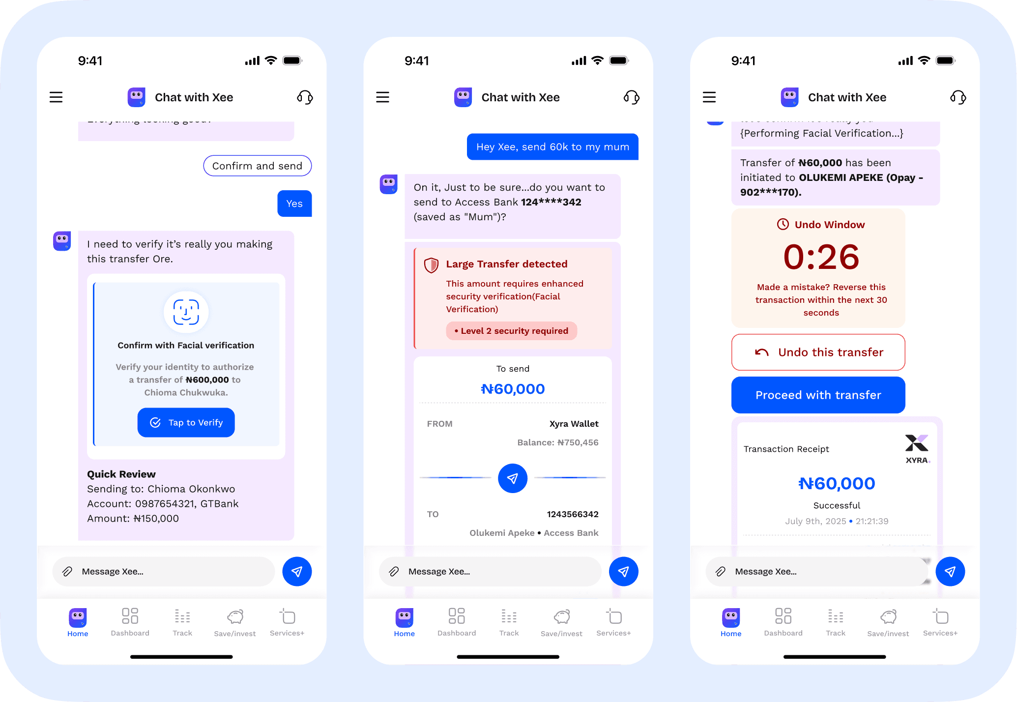
3. Trust & Clarity
Money is emotional. Every feature had to reinforce confidence and transparency.
We designed invisible guardrails to keep users safe:
Dual Confirmation: High-risk transactions (e.g., large transfers, new beneficiaries, bill payments) require a two-step verification process before being processed.
Undo Window: A 30-second buffer allows users to reverse transactions made in error.
Plain-Language Receipts: Every action generates a clear, human-readable receipt (not jargon-heavy banking codes).
Critical Steps: Logging in, linking accounts, sending large sums, or changing security settings all trigger additional safeguards (biometric + PIN + chat confirmation).
Why it Matters: Users fear losing money due to errors or fraud. By making security measures invisible until needed, we built trust without breaking flow.

4. Stickiness & Engagement
Great fintech apps don’t just manage money, they keep users coming back. I designed Xyra to measure and motivate progress.
X Score: A personalized financial health score that grows with user engagement (savings, spending, debt management).
Money Nests: Goal-based savings buckets presented with gamified progress indicators.
Smart Nudges: Gentle prompts like “You’re close to hitting your savings goal — want to top up ₦2,000?”
Most Important Metric: Retention — measured by weekly active use and recurring task completion. Every design choice was tied to keeping users engaged, not just acquired.


SUMMARY OF EXPERIENCE
Xyra is designed to feel effortless from the first interaction.
The user journey begins with a guided onboarding flow where accounts are linked and financial data is securely aggregated. Within moments, the user sees their entire financial landscape visualized clearly; balances, spending patterns, and trends unified across accounts and presented in an engaging manner (Money wrapped, adapted from spotify's wrapped).
This initial (Aha) moment of clarity is the first point of value: a fragmented financial picture becomes whole.
From there, the system introduces the X Score - A behavioral metric that quantifies financial health. The score evolves dynamically as users spend, save, and engage with insights, reinforcing awareness through feedback.
The core experience revolves around Natural Commands allowing users to perform financial actions or inquiries through simple text or voice input. This shifts control from navigation to conversation. The first time a command like “Transfer ₦20,000 from Zenith to GTB” executes instantly, the user experiences a second form of clarity: action without friction.
Beyond execution, Xyra builds rhythm through daily use.
Users check insights, adjust goals within Money Nests, and interact with Xee, the conversational agent that contextualizes spending behavior. Over time, the system becomes adaptive — learning from habits and surfacing timely nudges and advice.
Each layer of the experience is designed to reduce cognitive load and create emotional stability around money.
Xyra’s design philosophy is not just about interaction efficiency, but about restoring calm, context, and control to personal finance.
The project is still evolving. Design and product iterations continue as user feedback shapes the experience further.
Readers are kindly encouraged to check back periodically to see new developments, design refinements, and live insights from real user behavior.
Reflections
Looking back, the journey to designing Xyra revealed a few key lessons about problem framing, iteration, and speed to viable solutions:
Spend more time validating assumptions early: I jumped into exploration quickly, which created exciting ideas but also meant I had to backtrack several times. Next time, I’ll run quick user conversations and lightweight experiments earlier to confirm the real pain points before diving deep into design.
Prioritize ruthlessly: It’s tempting to design for everything at once; payments, savings, insights, gamification. But I learned that focusing on a single critical journey (like onboarding → first money transfer → first savings goal) gives a sharper MVP and faster path to launch.
Design in narrative form, not just screens: Storyboarding the end-to-end experience (instead of designing isolated screens) helped me connect features back to problems. Next time, I’ll lean even more into storytelling frameworks to ensure every flow has a clear “why.”
Problem-first framing works:
The clearest design moments came when I articulated the user problem directly beside the solution. This forced me to cut fluff and design only what matters.
Overall, this project reinforced that design isn’t about adding features, it’s about solving the right problems with precision.